Improving navigation by 50% and conversions by 20%
Creating a new website for a unique product, Legacy Cards, which enhanced user engagement, improving navigation by 50% and boosting conversions by 20%
Client name: Toni Noel
Team: Tara Tse, Adam Beasley, Nour Bireedo, Georgia Houston (in:Tangible team)
Role: UX Research
Time: 7 weeks
Tools: Figma, Miro, Shopify
A Touch From Beyond offers a unique service: allowing individuals nearing death to send physical cards to their loved ones after their passing. Within a week or two of their passing, loved ones receive a card adorned with two nearly embracing hands on the cover, along with a heartfelt sentiment or custom message from the departed.
Problem
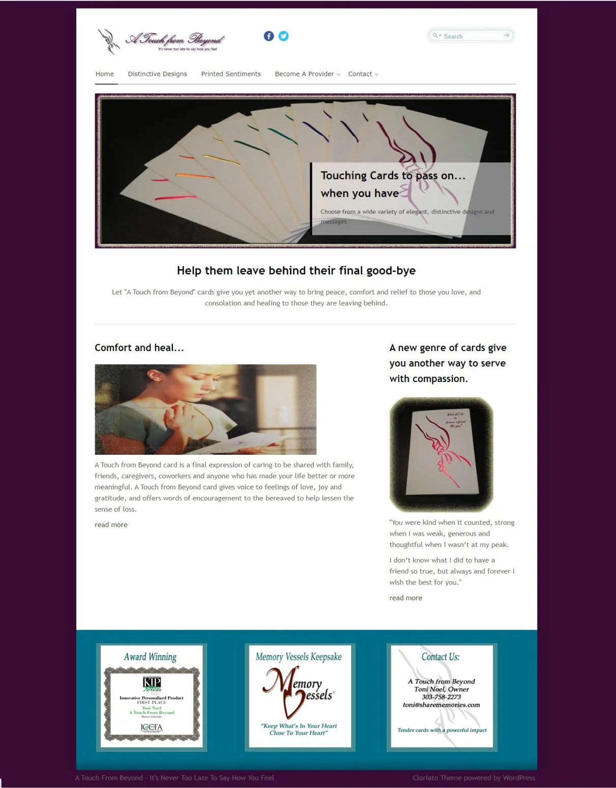
The company’s website is outdated, and not functional for an e-commerce business.
Our Tasks:
Establish an elegant, modern, and aesthetically pleasing e-commerce platform that enables our client to sell her physical cards in a digital space.
The website should create trust through strong visual design and generate visibility through improved online SEO
The website is to be aligned in visual branding to the already established branding on the cards and literature, to keep the physical products grounded in the e-commerce platform.
Overview
Research: User Interviews and insights, Competitive Analysis, User Journey and Empathy Maps
Inspiration, Ideation, and Information Architecture: mood boards, branding, and information architecture
Wireframes
Usability Testing
Final Design
Challenges and lessons learned
Research
Inspiration, Ideation, and Information Architecture
Wireframes
Usability Testing
Final Design
Challenges and Lessons learned
We conducted user interviews with potential stakeholders, including professionals in the End of Life industry such as psychotherapists, grief and bereavement specialists, and end-of-life doulas.
Interview Key Insights:
Personalizing the product adds value and increases the likelihood of the card being a cherished keepsake.
A pre-warning/explanation of card contents for the recipient should be considered to allow the bereaved to open the card when they feel ready.
For the recipient, the timing of delivery and opening of the cards is important as processing a loss is a subjective experience, that is slightly different for everyone.
There are currently unexplored markets within the End-of-Life Industry with the rise in popularity in recent years of Death Care Professionals, such as End-of-Life Doulas.
Research
Inspiration, Ideation, and Information Architecture
Wireframes
Usability Testing
Final Design
Challenges and Lessons learned
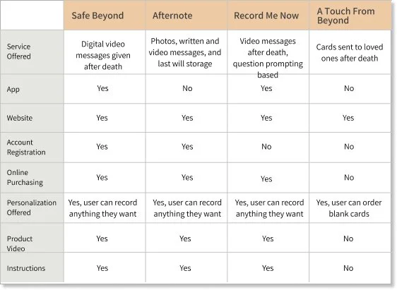
Competitive analysis
After researching various product lines, we identified similar offerings from other organizations. We specifically focused on products that enable users to leave messages to loved ones after their passing. However, we found that most offerings were digital, lacking a physical keepsake. Our competitive analysis was instrumental in contextualizing the issue and gaining insights into the End-of-Life industry.
Research
Inspiration, Ideation, and Information Architecture
Wireframes
Usability Testing
Final Design
Challenges and Lessons learned
Accessibility analysis
The overall accessibility findings from the individuals interviewed are as follows:
Ensure the website font is suitably large for users who may have issues with reading smaller text.
Verify the site color scheme is accessible for people with colorblind deficiencies to enable use by all users.
Promote a step-based purchase approach to keep the user informed of their position in the process.
Ensure the contrast ratio of text to background is very high for anyone with visual impairment.
Ensure content has plenty of breathing room, and where possible keep text off of images or on colored backgrounds when over images to promote readability.
Ensure top-level navigation is visible at all times so the user can see where they are in relation to the homepage, to prevent feelings of being lost or unable to navigate easily through the site
Research
Inspiration, Ideation, and Information Architecture
Wireframes
Usability Testing
Final Design
Challenges and Lessons learned
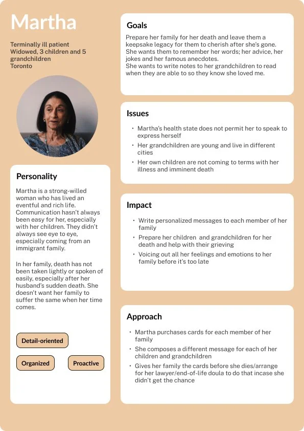
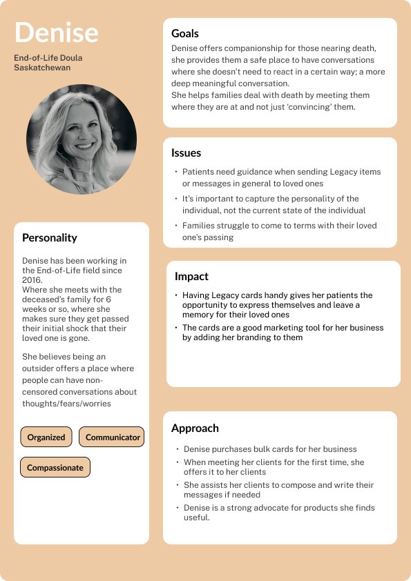
Personas
Based on interview findings and user research, I developed personas for this product. Creating these personas will enable me to design a product that is empathetic, inclusive, and user-friendly
Research
Inspiration, Ideation, and Information Architecture
Wireframes
Usability Testing
Final Design
Challenges and Lessons
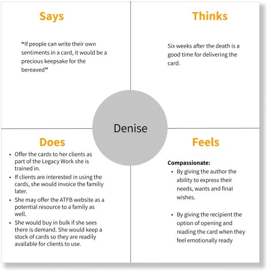
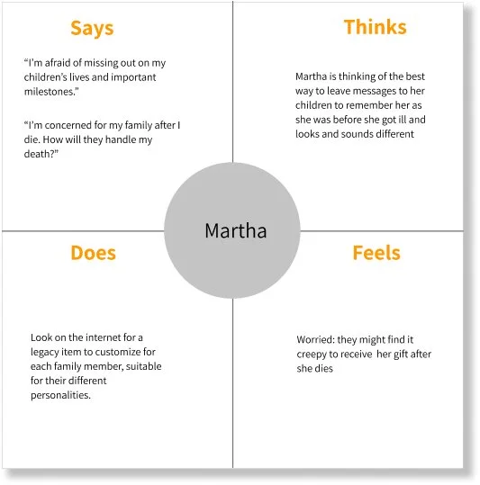
Empathy Map
Empathy maps were instrumental in visualizing our understanding of the users we interviewed. They helped us synthesize the research findings and effectively communicate our insights about the users to Toni. This process enabled us to move to the next phase of design, facilitating collaborative discussions to prioritize and address user needs
Empathy map for End of Life Doula purchasing cards for her business
Empathy map for an individual purchasing cards for her family
Research
Inspiration, Ideation, and Information Architecture
Wireframes
Usability Testing
Final Design
Challenges and Lessons
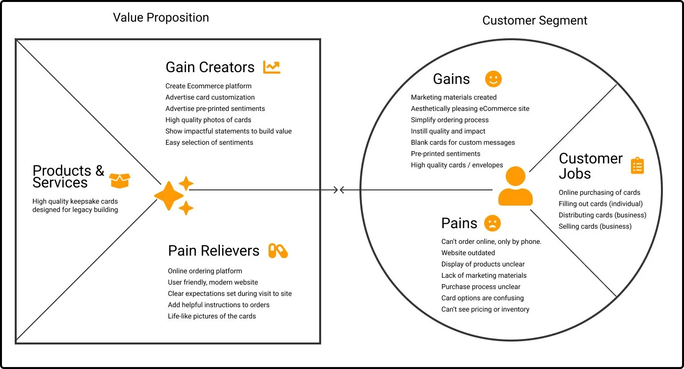
Value Proposition Canvas
This canvas outlined our understanding of our target users and assessed whether the website's offerings aligned with their needs.
This approach enabled us to evaluate if our features and pages effectively addressed user needs and alleviated pain points.
Additionally, we aimed to determine if the envisioned features would deliver value that meets users' expectations for what they seek to gain or achieve from visiting Toni's website
Research
Inspiration, Ideation, and Information Architecture
Wireframes
Usability Testing
Final Design
Challenges and Lessons
Exploring mood boards
Original logo/branding
Font exploration
Option 1
Option 2
After several rounds of deliberation with Toni, we finalized the style guide and selected the font.
Final style guide and typography
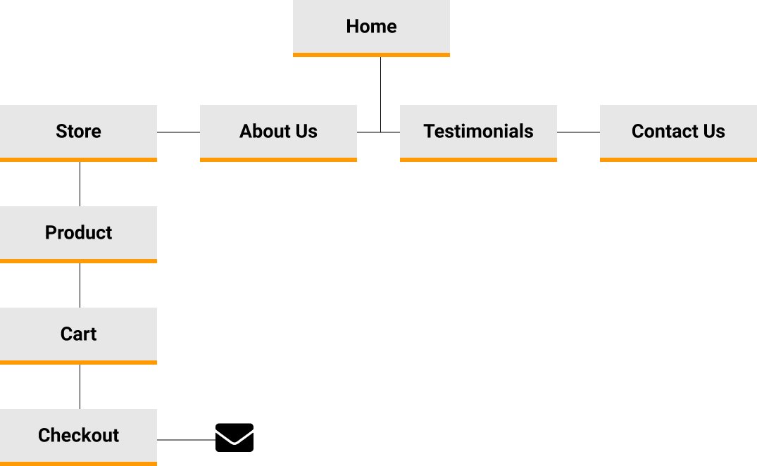
Information Architecture
Information architecture helped organize, structure, and label content effectively and sustainably.
Research
Inspiration, Ideation, and Information Architecture
Wireframes
Usability Testing
Final Design
Challenges and Lessons
Screen Blueprints Greyprints
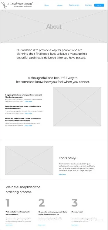
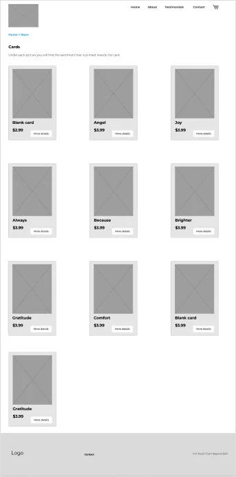
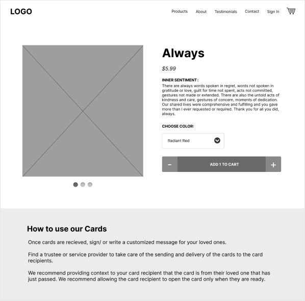
For Toni, the low-fidelity wireframes provided a low-level representation of user interaction, navigation, and functionality. They gave her the blueprint vision of how the website’s structure would look like.
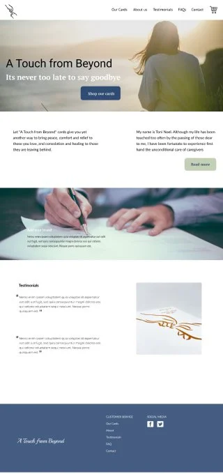
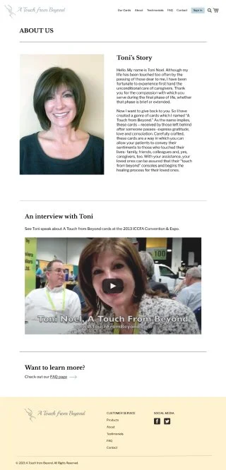
High-fidelity wireframes provided detailed visual maps that helped Toni visualize the two designs we came up with. With specific UI elements included, such as images of the actual cards, and Toni’s headshot image, these wireframes translated abstract ideas into tangible plans, saving the team much-needed time by reducing revisions.
Research
Inspiration, Ideation, and Information Architecture
Wireframes
Usability Testing
Final Design
Challenges and Lessons
Users testing
We sent out a self-guided user test, which asked the users to complete specific tasks and answer questions about the process and interaction with the website. The goal is to learn about anything hindering users from reaching our intended goals and to glean insights into what the individuals are experiencing as they navigate through the site. We want to understand their motivations, as well as their experience.
Questions Asked
1. What do you think the website is about?
2. How easy is it to figure out the product offered?
3. On a scale of 1-5, 5 being the highest, how readable and legible is the font on the site?
4. Is the navigation clear?
5. Do you think the amount of text on each page is reasonable?
Tasks to be Completed
1. In how many clicks were you able to complete a purchase of 500 Radiant Red Cards?
2. When should a card be delivered to a loved one, after passing?
3. Send a message inquiring about the Friends cards.
4. Find the Comfort card, order 12, and checkout.
5. Sign in with a username and password, and purchase a bulk amount of Always cards, Angels cards, and My Life cards.
In summary, the feedback was positive; the site is clean, easy to use, understand and read. We recommend some small changes, but overall the users had a great experience using the site.
Some user insights
“I like the idea - would look forward to a wider range of options in cards - some with humor sentiments and some with different images”
“I noticed that some of the pages that have individual cards don’t show a picture of what’s written. Also, it would be easier if I could determine the quantity without the need to go to the cart and adjust it from there. Great job.”
“The slider with the steps might be a bit too tall, I can’t see the slider arrows until I scroll down. Maybe shorten it, or have it auto-scroll.”
“The layout of the website is very user friendly, and the idea of it is also excellent.”
Research
Inspiration, Ideation, and Information Architecture
Wireframes
Usability Testing
Final Design
Challenges and Lessons
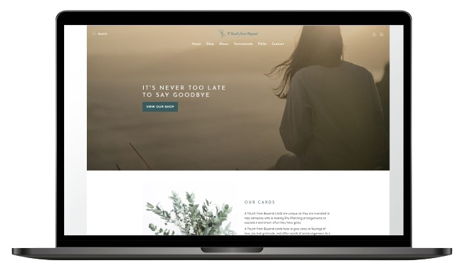
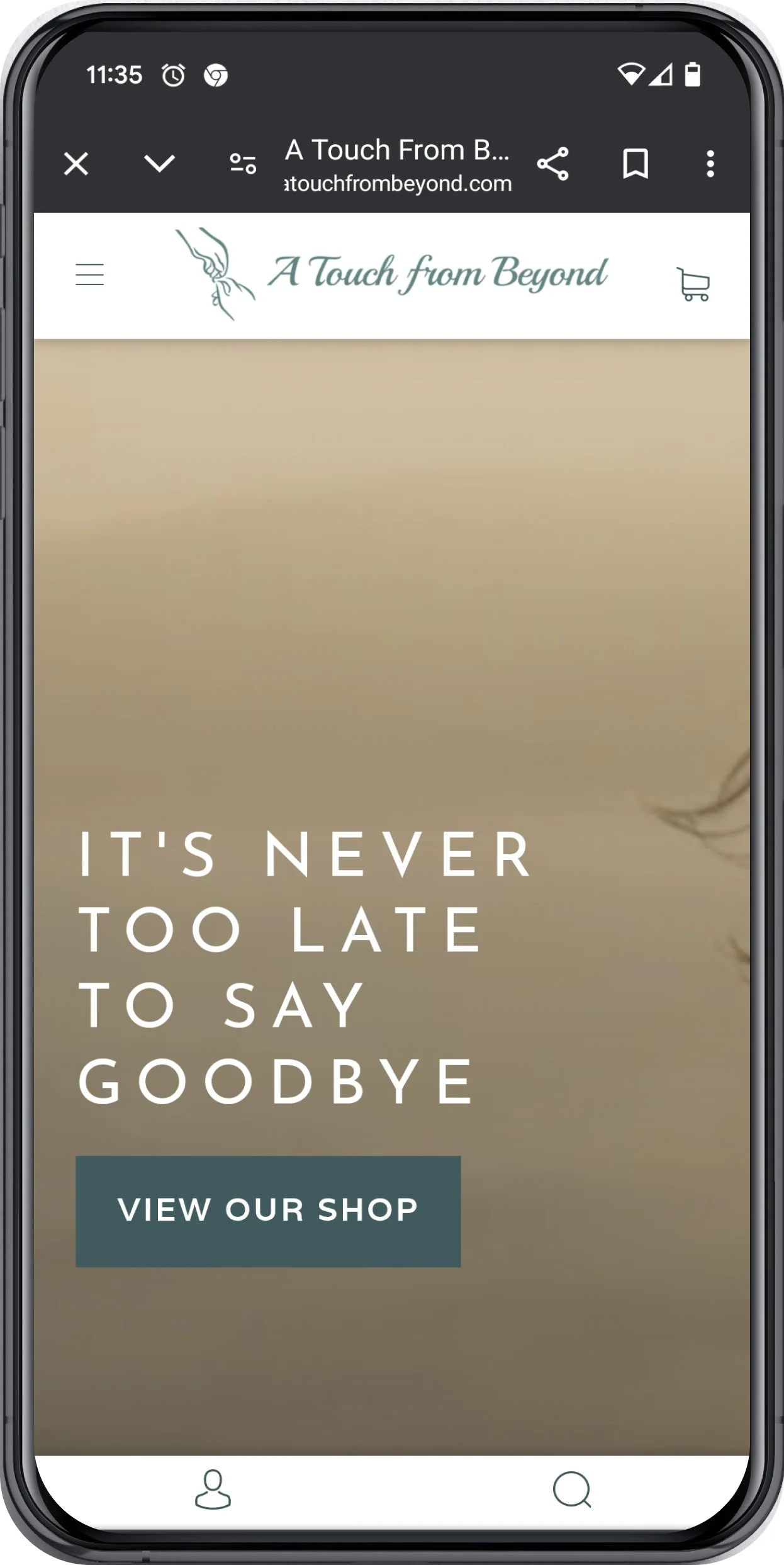
The Big Reveal
The website is live and accepting orders.
Research
Inspiration, Ideation, and Information Architecture
Wireframes
Usability Testing
Final Format
Challenges and Lessons
In conclusion,
The challenges faced that faced us:
Our client has been away for a while and was not in touch with former customers who could serve as interviewees for our research. Taking the lead in user research, I began reaching out to stakeholders through cold calls and emails, including funeral homes, End-of-Life doulas, and grief therapists. Fortunately, four stakeholders have responded, allowing us to kickstart our research.
Shopify’s challenges for first-time users involved understanding its interface, workflow and customizing themes for our wireframes
I learned the following lessons:
Research, Research, Research!
Working in a well-integrated and understanding team makes it or breaks it!
Discovery of a whole new market: End of life Industry
Time constraints: Work smarter, not harder

